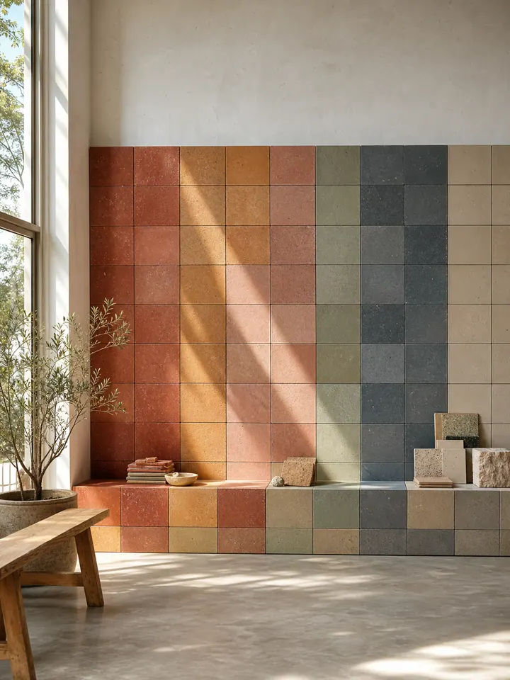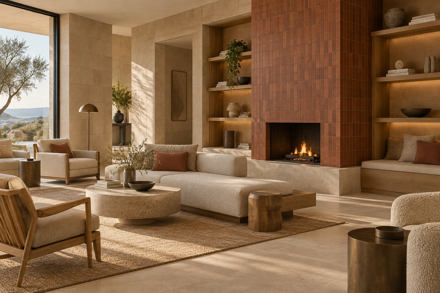
Una paleta interior cálida y convincente suele darle a cada color un trabajo claro: un tono neutro forma el campo principal, un tono más claro controla el brillo y un color más profundo crea el enfoque. Dentro del actual CLEM COLO. La gama CLEM, C03 Warm Sand, C05 Ivory Stone y C02 Terracotta Red se pueden probar para esos tres roles.
Las imágenes de esta guía son visualizaciones de diseño generadas por IA creadas para CLEM. Exploran la ubicación del color y las relaciones materiales; no son fotografías de proyectos CLEM completados, muestras exactas de productos ni evidencia de desempeño técnico. Utilice las páginas de productos actuales y las muestras físicas identificadas para tomar decisiones sobre especificaciones.
¿Cuál es la forma más sencilla de combinar arena, marfil y terracota?
Elija primero la superficie principal. Si la habitación necesita un fondo beige, comience con C03 Warm Sand. Si necesita un campo cremoso más claro, compare C05 Ivory Stone. Introduzca C02 Terracotta Red solo después de decidir dónde debe detenerse la vista: el frente de un bar, el mostrador de una recepción, el volumen de una chimenea o un plano de pared más pequeño pueden tener más peso visual que un acento decorativo disperso.
Piense en roles en lugar de en una fórmula de color fija:
- **Campo principal:** la superficie más grande de pared o suelo que establece la calidez general de la habitación
- **Transición de luz:** una superficie de marfil que separa los materiales más oscuros o lleva la luz del día más profundamente al esquema.
- **Acento focal:** un área de terracota controlada que marca un destino o característica arquitectónica
- **Material de conexión:** madera, lechada, metal o textil que repite un tono en los tres colores.
Este enfoque es más fácil de probar que elegir todos los acabados de forma independiente. También le da a la revisión de la muestra una pregunta clara: ¿cada material soporta el papel asignado bajo la iluminación real del proyecto?
¿En qué se diferencian los tres colores CLEM?
C03 Warm Sand se describe actualmente como una combinación de colores beige arena con una base beige galleta clara y gránulos finos oscuros y pálidos. Es el tono medio de esta paleta: más cálido y arraigado que el marfil, pero más tranquilo que el rojo terracota.
C05 Ivory Stone está catalogado como marfil cálido. La descripción actual del producto señala una base cremosa con escasos puntos ocres y grises. Puede crear un campo más claro, pero debe compararse con la pintura, la piedra, los sanitarios o la encimera blancos del proyecto en lugar de tratarse como blanco puro.
C02 Terracotta Red está catalogado como un rojo óxido apagado y más profundo con moteados finos y densos. Aporta un contraste más fuerte y puede conectarse visualmente con roble, metal envejecido o lechada neutra cálida. "Terracota" es el nombre del color aquí; La página del producto identifica el C02 como una combinación de colores de losetas minerales compactadas en lugar de las tradicionales losetas de terracota de arcilla cocida.
Las pantallas y las imágenes generadas no pueden reproducir con precisión un lote suministrado. Compare las piezas físicas identificadas con el acabado deseado antes de aprobar el color.
¿Dónde funciona mejor Warm Sand en la paleta?
Utilice C03 Warm Sand cuando la superficie principal deba sentirse cálida sin convertirse en la característica más fuerte. Una pared ancha detrás de una carpintería, un suelo que conecta varias zonas o el marco de una chimenea pueden servir como fondo estable para muebles e iluminación en color beige arena.
Coloque la muestra al lado de la madera real. El roble pálido, la madera en tonos rojos y la carpintería teñida de oscuro pueden hacer que el mismo beige parezca diferente. Luego agregue la lechada propuesta: un color de lechada cercano crea un campo más tranquilo, mientras que una lechada contrastante hace que el módulo y el patrón de juntas sean más visibles.
¿Cuándo debería convertirse la Piedra Marfil en la superficie principal?
C05 Ivory Stone es una comparación útil cuando la habitación necesita más luminosidad visual o cuando la carpintería oscura y un acento rojo ya tienen un peso considerable. Puede colocarse frente a una pared ancha, detrás de estanterías abiertas o en un plano contiguo que necesita permanecer en calma.
Marque C05 junto a cada "blanco" cercano. Un cálido azulejo de marfil, una pared blanca fría y un grifo sanitario blanco brillante pueden parecer relacionados de forma aislada, pero separados marcadamente en sus uniones. Revise las muestras físicas vertical y horizontalmente porque la luz incide de manera diferente en paredes y pisos.
¿Cómo puede Terracotta Red crear concentración sin abrumar la habitación?
Dé a C02 Terracotta Red un límite arquitectónico legible. El frente de un bar, el mostrador de recepción, el volumen de la chimenea o un tramo de pared seleccionado son más fáciles de leer que pequeños parches rojos distribuidos por toda la habitación. Repita el rojo de forma más silenciosa a través de textiles, obras de arte o un pequeño detalle material si el espacio necesita continuidad visual.
La imagen de hospitalidad generada utiliza terracota en el frente de la barra, mientras que el marfil y la arena cálida siguen siendo los campos circundantes más grandes. Este es un ejemplo de composición, no una instalación completa. El área adecuada depende del tamaño de la habitación, la distancia de visión, la luz natural y el peso visual de los muebles.
¿Cómo afectan el formato de las baldosas y la lechada al resultado?
Las actuales páginas de productos C03, C05 y C02 enumeran cuatro formatos: 15 × 15, 7,5 × 15, 5 × 15 y 3,6 × 15 cm. También muestran las opciones de acabado de borde recto y acabado lavado con agua. Confirme la combinación exacta disponible al solicitar muestras.
Un módulo de 15 × 15 cm produce una cuadrícula más uniforme. Un formato largo de 3,6 × 15 cm introduce más articulaciones y un ritmo direccional más fuerte. Los diseños apilados, continuos y verticales pueden hacer que el mismo color parezca más tranquilo o más activo. Simule el formato propuesto y lechada juntos; La aprobación del color por sí sola no resuelve el patrón terminado.
No traspasar supuestos de espesor, deslizamiento, manchas o mantenimiento de un formato o acabado a otro. Solicite la información técnica actual que aplica al producto seleccionado, acabado y uso previsto.
¿Qué debe ir en el tablero de materiales del proyecto?
Construya un tablero alrededor de los cruces reales de la habitación:
- Muestras identificadas de C03, C05 y C02 en el acabado propuesto.
- El color real de la pintura o el yeso.
- Madera o laminado del proveedor de carpintería.
- Muestras de encimeras, metales y textiles.
- Colores de lechada propuestos y ancho de junta
- Una nota que indique la aplicación prevista para pared, piso o carpintería.
Revisar el tablero a la luz del día y bajo la iluminación artificial especificada para el proyecto. Mueva las piezas de los azulejos a la orientación en la que se instalarán. Mantener registrado el tablero aprobado o muestras retenidas con los códigos de producto, acabado, formato, fecha y referencia del proveedor.
¿Las tres imágenes de esta guía son proyectos reales de CLEM?
No. Son imágenes conceptuales editoriales generadas por IA creadas para explicar una paleta cálida de arena, marfil y terracota. No muestran los colores exactos de CLEM, un proyecto instalado, un lote suministrado, detalles de construcción o rendimiento probado.
La imagen del tablero de materiales es útil para planificar qué comparar. Las imágenes del salón y la hospitalidad ilustran la posible ubicación del color. Las decisiones finales deben basarse en la información actual del producto, la documentación técnica y las muestras físicas suministradas o confirmadas para el proyecto.
¿Qué se debe confirmar antes de la especificación?
Actualmente, las tres páginas de productos enumeran paredes interiores, suelos interiores y uso exterior donde el acabado técnico seleccionado es adecuado. Esa redacción no hace que todos los colores y acabados sean adecuados para todas las aplicaciones húmedas, exteriores o de mucho tráfico.
Enviar a CLEM la ubicación del proyecto, superficie, área aproximada, formato preferido y acabado previsto. Solicite la información aplicable sobre espesor, acabado, instalación, sellado, mantenimiento y desempeño. Si el proyecto incluye piso de baño, exposición exterior u otra condición exigente, identifíquelo claramente antes de la selección.
¿Qué debe incluir una solicitud de muestra?
Utilice un resumen que pueda responderse sin adivinar:
> Ayúdenos a comparar C03 Warm Sand, C05 Ivory Stone y C02 Terracotta Red para [proyecto y ubicación]. Estamos considerando [pared, suelo o superficie de carpintería] en [formato preferido]. Los acabados adyacentes son [pintura, madera, metal y otros materiales]. Confirme las opciones de muestra adecuadas, los acabados disponibles y la información técnica actual para esta aplicación.
Comience con el color principal del campo y luego pruebe cómo lo soportan el marfil y la terracota. Una jerarquía de materiales clara, un conjunto de muestras identificado y una comprobación técnica específica de la aplicación producirán una decisión más fiable que elegir únicamente a partir de una imagen en pantalla.
Notas de investigación
Fuentes y verificación
- Nombres de productos, tonos, formatos enumerados, opciones de acabado y redacción de la aplicación: páginas actuales del producto CLEM revisadas el 10 de septiembre de 2026. Las tres imágenes de los artículos son visualizaciones del concepto editorial CLEM generadas por IA; no son fotografías de productos, colores precisos del lote ni evidencia de un proyecto completado.
- https://www.clemstonetiles.com/product-c03-warm-sand.html
- https://www.clemstonetiles.com/product-c05-ivory-stone.html
- https://www.clemstonetiles.com/product-c02-terracotta-red.html
Se debe confirmar la idoneidad técnica y la disponibilidad actual para cada proyecto.