A collectible card store has to support several kinds of attention at once. Customers may be scanning a wall of graded cards, comparing items at a counter, joining a game, waiting for an appraisal or simply trying to understand where to begin. When every display competes for attention, the room can quickly feel more like storage than a considered retail interior.
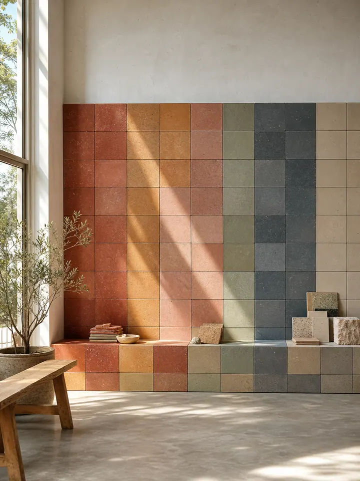
The material strategy can help restore order. A restrained field of recycled mineral tiles gives the store a durable architectural base, creates a clear visual rhythm and allows small, detailed products to remain legible. The aim is not to turn every surface into a feature. It is to use colour, scale and placement to make the store easier to read.
This guide looks at how tiles can organise a collectible card shop without overwhelming the collection, from the first sightline and display wall to lighting, grout, circulation and long-term maintenance.
Begin with one clear visual hierarchy
Before selecting a colour, decide what customers should notice first. In most collectible card stores, the primary visual destination is a secure graded-card display or a carefully edited feature wall. The floor, counter and lighting should guide the eye towards that destination rather than creating several competing focal points.
A useful hierarchy is:
1. the main graded-card cabinet or product wall;
2. the tiled architectural field that frames it;
3. the central counter or consultation point;
4. secondary stock and operational equipment.
This order keeps the valuable collection visible while allowing the material to define the room. It also makes the entrance easier to understand: customers can see where to browse, where to ask for help and which areas are intended for longer consultation.
Use tile to organise zones without adding clutter
Retail zoning is often handled with signs, graphics, different furniture families and changes in ceiling treatment. In a small store, too many of these devices can make the room feel fragmented. Tile can create the same distinction more quietly.
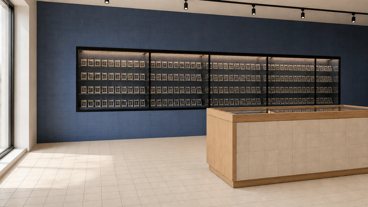
A deep mineral-coloured tiled wall can identify the principal display zone. A lighter floor can create continuity through the browsing and consultation areas. The front of a counter can repeat the floor colour so that the counter belongs to the architecture instead of reading as another independent object.
The transitions should be simple. One wall colour and one floor colour are usually enough to establish a clear relationship. If a third material is required, use it as a neutral support - warm timber, black metal and clear glass can frame the collection without introducing another strong colour field.
Limit the palette so the cards remain legible
Collectible cards already contain many colours, illustrations, labels and reflective surfaces. A multicoloured interior can amplify that visual noise. A limited palette gives the collection a stable background and helps customers compare individual pieces.
Start with one dominant tile colour and one secondary colour. A warm ivory floor can reflect daylight and keep the circulation area open, while slate or mineral blue can give the display wall depth. The contrast is clear, but neither colour needs to be bright.
Proportion matters. Let the dominant colour occupy the larger continuous surface - often the floor - and use the secondary colour to frame the main cabinet wall. Timber, glass and black metal can then remain consistent across fixtures.
Review physical samples beside the actual cabinet finish and under the proposed lighting. Card slabs, glass doors and black display frames can make an adjacent colour appear lighter or cooler than it does on its own.
Match tile scale to the viewing distance
Tile size changes how quickly a surface is read. A large module creates a broad, calm field. A smaller module creates a finer grid and can make the floor feel more deliberately scaled to a compact retail room.
For a collectible card store, a smaller square module can work well across the floor because the repeated joints provide subtle orientation without relying on arrows or decorative bands. The grid can reinforce the direction of circulation and help align display islands, counters and cabinet bays.
On the main wall, a regular square module can form a precise background for the repeated geometry of graded-card slabs. The wall and floor do not need to use the same size. A slightly smaller wall module can create a denser frame around the cabinet, while the floor remains comfortable at walking scale.
Always confirm current CLEM format and finish availability for the selected product. Build the layout around actual module dimensions, joint widths and perimeter conditions rather than scaling a visualisation after the fixtures have already been designed.
Consolidate graded-card cabinets into one architectural run
Many collectible stores need substantial secure display capacity. The answer does not have to be a series of unrelated cabinets. A continuous built-in run can hold a large collection while reading as one calm architectural element.
Use consistent bay widths, shelf spacing, frame colour and lighting. Align cabinet divisions with the tile grid where possible. Repetition then becomes a form of order: the eye reads one long display wall first and the individual cards second.
Keep the surrounding tiled field visible. A margin of tile above, below or beside the cabinets helps the material frame the collection. If cabinetry fills every available centimetre, the wall loses its architectural role and the store can feel crowded even when the aisle is physically clear.
Closed lower storage is useful for boxes, packaging and operational equipment. It prevents back stock from competing with the displayed collection and keeps the public zone visually controlled.
Control reflections before increasing brightness
Graded slabs, glass cabinet doors and glazed display tops can produce multiple layers of reflection. Adding more light does not automatically improve visibility. It can create glare that obscures card artwork and labels.
Use discreet, continuous lighting within the cabinet and position ceiling fittings so their brightest reflections do not sit directly in the customer's normal viewing angle. A matte tiled surface provides a quieter background than a highly reflective wall finish and helps the illuminated cards remain the brightest detailed elements.
Test the full assembly, not only the light fitting. The mock-up should include the tile, grout, cabinet glass, frame colour, shelf lighting and at least several representative graded slabs. Review it from standing and seated positions and from both ends of the main aisle.
Daylight also needs control. A window can give the store a welcoming front, but direct light on a cabinet may create glare and uneven viewing conditions. Use the plan, blinds or cabinet orientation to moderate direct reflections while retaining a naturally lit circulation area.
Keep circulation separate from long consultation
A card store often combines quick purchases with activities that take more time: valuation, trade-in, deck discussion or collection review. These uses should not block the main browsing path.
Maintain a clear route from the entrance to the primary display and counter. Place the consultation island beside this route rather than directly across it. The tiled floor grid can help test the clear width and keep furniture aligned during daily use.
If play tables are included, treat them as a secondary zone. They require their own acoustic, lighting and storage considerations and should not visually overwhelm the retail display. Repeating the same limited material palette can connect the two zones without making them identical.
Avoid filling leftover corners with additional fixtures. A small amount of negative space improves sightlines, makes the main surfaces easier to appreciate and allows the shop to adapt during launches or busy trading periods.
Design the counter as part of the material system
The counter is often the most frequently touched and viewed fixture in the store. It can support the material story without becoming a separate feature colour.
Repeating the dominant floor tile on the counter front creates continuity. The module should be set out from the centre or from a clearly defined edge so cut pieces are balanced. Align horizontal joints with adjacent cabinet plinths or display edges when practical.
Protect exposed corners with a considered edge detail suitable for the selected tile and use. Confirm how the counter will accommodate access panels, cable routes, point-of-sale equipment and ventilation before fixing begins. A clean front elevation is easier to achieve when these services are resolved early.
The counter top and display case should remain visually light. Clear glass, a slim dark frame and a warm timber touch surface are usually enough to support the tiled base.
Treat grout as part of the display composition
Grout determines how strongly the module is perceived. A close tonal match creates a quieter field; a contrasting joint makes every tile more graphic. In a store already filled with small rectangular objects, a very high-contrast grid may introduce unnecessary competition.
Choose a joint colour that supports the tile while remaining practical for the application. Review the grout beside the tile, cabinet frame and floor under the final lighting. The same warm-grey joint may appear darker against ivory and lighter against mineral blue.
Set-out accuracy is particularly visible where long cabinet lines meet the tile grid. Coordinate datum lines between the installer and joiner before either trade begins. Small discrepancies that seem minor on a drawing can become obvious across a long repeated display.
Movement joints, perimeter joints and transitions must follow the project requirements and the selected installation system. They should be incorporated into the visual set-out rather than hidden or decided at the end of the build.
Specify for the actual operating conditions
Material selection should respond to the way the store will operate. Entry zones may receive grit and moisture. Chair movement can affect a play area differently from a quiet browsing aisle. Counters and appraisal points experience frequent contact, while cabinet walls are primarily visual surfaces.
Confirm the appropriate CLEM product, finish, thickness, substrate, adhesive, grout and maintenance method for each application. Do not assume that one surface finish is suitable for every wall, floor and external threshold.
Plan a cleaning routine that protects both the tile and the merchandise. Dust and residue are more noticeable under cabinet lighting, but aggressive cleaning around valuable cards and joinery is undesirable. Use the specified cleaning products and protect cabinets, metalwork and stored items during installation and final cleaning.
Retain labelled spare tiles from the supplied material. A documented reserve makes future repairs or counter alterations easier and helps preserve the original colour relationship.
Build one representative mock-up
A useful mock-up should test more than colour. Include:
- the proposed floor and wall tile modules;
- the actual joint width and grout colour;
- a cabinet frame, glass type and shelf light;
- representative graded-card slabs;
- the proposed timber or counter finish;
- the junction between tile and joinery;
- the cleaning method and final surface appearance.
View the mock-up at the same distance customers will use in the finished store. Check the material in daylight and under the complete artificial-lighting scene. Photograph the approved assembly and record product codes, formats, finishes and joint decisions for the construction team.
A concise design checklist
Before finalising a collectible card store, confirm:
- one clear primary display destination;
- a dominant tile colour and no more than one secondary tile colour;
- visible, accurately scaled tile modules in the floor and wall set-out;
- consolidated graded-card cabinets with consistent bays and lighting;
- sufficient tiled margin around the principal cabinet run;
- controlled reflections on slabs, glass doors and display tops;
- clear circulation that does not cross long consultation activities;
- a coordinated counter edge, service and access strategy;
- grout and movement joints included in the elevation and floor plan;
- a representative mock-up under the final lighting;
- confirmed installation, cleaning and retained-stock requirements.
A successful collectible card store does not need to compete with the collection. When colour is restrained, cabinets are consolidated and tile modules are set out with care, the room becomes easier to understand. The cards remain detailed and individual, while the recycled mineral surfaces give the store a calm, durable and recognisable architectural identity.
Explore CLEM colours and modular formats, or contact CLEM Stone Tiles to review samples for a retail project.
Research notes
Sources & verification
- https://www.clemstonetiles.com/
- https://www.clemstonetiles.com/products.html
- https://www.clemstonetiles.com/sizes.html
- https://www.clemstonetiles.com/applications.html
Technical suitability and current availability should be confirmed for each project.