Hospitality interiors have to do several things at once. They create a first impression, support a clear customer journey and withstand repeated daily use. Every surface contributes to that experience, but tile has a particular influence because colour, scale, texture and joints are all visible at once.
For a café, restaurant, bar or hotel, the best tile choice rarely begins with a single favourite sample. It begins with the role the surface needs to play. Should it make the entrance memorable, give a long bar more rhythm, bring warmth to a dining room or create a quieter background for furniture, lighting and food?
Once that role is clear, colour, format and pattern can be considered as one connected system rather than three separate decisions.
Begin with the place and the way it will be used
Before choosing a colour palette, map the areas where tile is being considered. A wall behind a banquette, a bar front, an entry floor and a bathroom wall may belong to the same visual language, but they do not have the same technical requirements.
Ask where customers first see the material, where they pause and where the surface will be viewed from only a few centimetres away. Then identify the practical conditions: foot traffic, spills, cleaning routines, water exposure, changes in level, exterior thresholds and transitions to other finishes.
This first step prevents a common specification problem—selecting a surface for its appearance and asking it to perform a job that has not yet been defined. Product suitability, finish, slip resistance and installation requirements should always be confirmed for the intended location rather than assumed from the material category alone.
It also helps establish visual priorities. Most hospitality spaces benefit from a hierarchy:
- a calm field that supports the overall atmosphere;
- one memorable moment that gives the venue identity;
- smaller transitions or details that connect the scheme.
Tile can perform all three roles, but it does not need to perform all three everywhere.
Build the colour strategy around atmosphere and light
Colour changes throughout the day. Warm evening lighting can deepen red and terracotta tones, while cool daylight can make pale neutrals feel cleaner and more mineral. Dark grout can sharpen a grid; a close tonal match can make the same layout feel softer and more continuous.
For that reason, it is useful to build a hospitality palette in three layers.
**The base colour** should occupy the largest visual area and sit comfortably with the flooring, joinery and wall finishes around it. Warm neutrals such as sand and ivory can create a quiet field without feeling clinical.
**The anchor colour** gives the interior character. CLEM C01 Original Red can add warmth and depth to a bar, entry or feature wall, while C04 Sage Mist can introduce a calmer connection to timber, planting and muted upholstery.
**The connecting tone** appears in smaller amounts—a border, a band, a change in format or a repeated detail—to link the tiled area with furniture, metalwork or signage.
This does not require three different tile colours in every project. A single-colour installation can gain variation through tile orientation, surface character and grout. Conversely, a two- or three-colour layout can remain composed when one colour is clearly dominant.
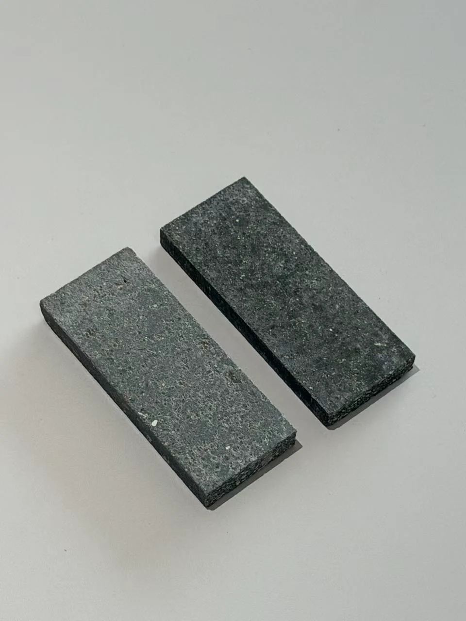
Always review physical samples with the actual lighting specification and adjacent materials. Look at several pieces rather than one isolated tile: subtle tonal variation is part of a mineral surface, and it should be understood at the scale of the proposed installation.
Let format establish the rhythm
Format affects how quickly the eye moves across a surface. Broad square fields tend to feel steady and architectural. Narrow linear formats create direction. Small mosaics produce a denser, more tactile grain and can give curved or highly detailed areas greater flexibility.
Within the CLEM COLO. Clem range, the current product information identifies 15 × 15 cm, 7.5 × 15 cm, 5 × 15 cm and 3.6 × 15 cm formats, together with 5 × 5 cm and 2.5 × 2.5 cm mosaics. Availability and the selected finish should be confirmed for the individual colour and project.
In a hospitality setting, each scale can support a different purpose:
- **15 × 15 cm squares** create a legible field and work well when colour is intended to lead.
- **Rectangular and linear formats** can lengthen a bar front, emphasise a horizontal datum or draw movement toward a focal point.
- **Small mosaics** create detailed texture and make the joint network a stronger part of the design.
- **Geometric formats** can be used as accents, borders or complete patterned fields when the architecture calls for a more distinctive rhythm.
The size of the room is not the only guide. Viewing distance matters just as much. A small-format pattern that feels intricate on a sample board may read as a unified texture from across a restaurant. A broad grid that feels restrained on plan may become a strong graphic device when it wraps a long counter.
Before approval, draw the layout at the real elevation size. Check where cuts land at corners, doors, niches, fixtures and the ends of joinery. A considered set-out is often more important to the final result than choosing the most unusual format.
Use pattern to organise attention
Pattern is most effective when it has a clear job. It can identify the host point, frame a counter, mark a circulation route, distinguish a threshold or bring energy to a compact room. Without that purpose, several competing patterns can make a hospitality interior feel visually busy.
A checkerboard is a useful example. Its strong two-colour rhythm can make a floor or bar front immediately recognisable, yet the result changes significantly with colour contrast and scale. CLEM's ZDORA Checked Pattern is organised as a 30.9 × 30.9 cm net module in coordinated colour palettes, offering a ready-made way to introduce repeated geometry. Project availability and technical suitability should be confirmed before specification.
For a quieter result, use close tonal neighbours or repeat one colour in two formats. For a more graphic result, increase the contrast and keep the surrounding surfaces controlled. One dominant pattern, supported by calmer adjoining materials, is usually more memorable than several motifs competing for attention.
Orientation can also become wayfinding. Vertical stacks lift a low wall visually; horizontal runs lengthen a counter; diagonal or geometric changes can signal a threshold. The pattern should respond to the architecture instead of appearing as a decoration placed on top of it.
Treat grout as part of the composition
Every tiled surface is also a joint pattern. Grout colour, joint width and set-out can either clarify the geometry or soften it.
A grout colour close to the tile can allow mineral texture and overall colour to lead. A contrasting grout makes each module more visible and gives the installation a stronger graphic grid. Neither approach is universally better. The decision should follow the intended atmosphere, the scale of the format and the cleaning expectations of the space.
Review grout with real tile samples, not from a digital swatch. Where colour contrast is important, build a sample panel large enough to include several joints and any relevant corners or transitions. The installer and project team should also coordinate substrate preparation, joint dimensions, movement joints, sealants and compatible installation products.
Choose finish with light, touch and maintenance in mind
Surface finish affects more than appearance. It changes how light moves across a wall, how the material feels at close range and how texture is perceived over a large area.
CLEM product information currently presents Straight-Edge and Water-Washed finish options for selected colours. A straighter edge can give the layout a clearer modular reading, while a water-washed surface can emphasise tactile mineral character. Exact availability varies, and the finish still needs to be assessed against the intended wall, floor, wet-area or exterior use.
For hospitality projects, confirm the cleaning method early. A highly articulated surface may be appropriate for a bar front or feature wall but require a different maintenance approach from a floor or food-preparation zone. Where slip, stain, abrasion, water or exterior performance matters, request the relevant technical evidence for the exact product and finish being specified.
Test the complete idea, not one tile
A single sample can confirm colour, but it cannot show the full installation. A useful hospitality mock-up should bring together:
- several tiles from the proposed colour or batch;
- the intended format and orientation;
- representative grout colour and joint width;
- the selected finish;
- adjacent timber, stone, metal, paint and upholstery;
- the project's daylight and artificial lighting conditions.
View the mock-up from both close range and the expected customer viewpoint. Photograph it in morning, afternoon and evening light if the venue's atmosphere changes across the day.
This process often reveals that a strong colour needs more breathing room, a joint should be quieter or a pattern needs to begin at a different architectural point. Those are inexpensive decisions at sample stage and disruptive ones after installation.
A practical specification checklist
Before the tile package is finalised, record:
1. Product collection, colour code, finish and nominal format.
2. Real dimensions, thickness and weight where these affect set-out or substrate design.
3. Intended wall, floor, wet-area, exterior or high-traffic application.
4. Required evidence for slip, water absorption, stain, abrasion, freeze-thaw or other project-specific performance.
5. Approved sample range, expected tonal variation and batch-control process.
6. Grout type and colour, joint width, movement joints, sealants and edge details.
7. Compatible adhesive, substrate preparation and any sealing requirements.
8. Cutting strategy, quantity allowance, breakage and future replacement stock.
9. Cleaning products, maintenance method and the party responsible for handover information.
The most successful hospitality tile schemes balance identity with discipline. Colour establishes atmosphere, format creates rhythm and pattern directs attention—but each decision is strengthened by a clear set-out, representative samples and project-specific technical confirmation.
CLEM's recycled mineral colours and modular geometries are designed to be combined, whether the brief calls for a quiet tonal field, a linear bar front or a distinctive checked moment. Explore the collection, request samples and speak with the CLEM team about the formats and finishes suited to your project.
Research notes
Sources & verification
- CLEM current product, application and technical-size documentation.
- Project-specific technical performance should be confirmed before specification.
Technical suitability and current availability should be confirmed for each project.
