When choosing checkerboard floor tiles, pick the contrast first and the two colours second. A high-contrast checkerboard, such as charcoal and ivory, reads as a bold graphic from across the room. A low-contrast one, such as terracotta and sand, reads as warm texture. For most cafés and restaurants the right answer sits in between, and it depends on the size of the room, how far away people see the floor or wall, and what else in the space is competing for attention.
This guide walks through those decisions with real pairings from the Clem Colour Palette. All 20 colours are recycled stone tiles pressed in Foshan and available in the same square and mosaic formats, so any two colours can sit side by side in one grid.
Which checkerboard tile colours work together?
Most checkerboard decisions go wrong when the team picks two colours they like separately and only sees them together on site. Decide first how loud the pattern should be, then choose the pair that delivers it.
| Contrast | Example pairing | How it reads | Where it tends to work |
|---|---|---|---|
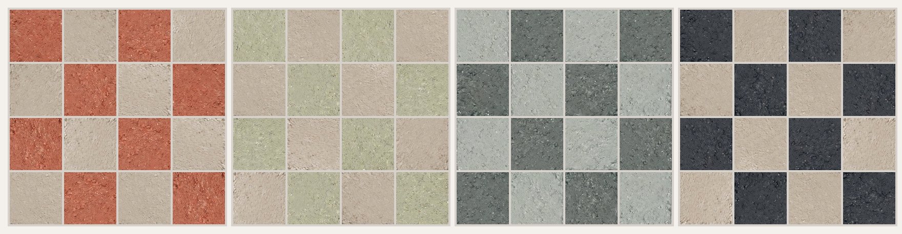
| High | C08 Charcoal Black + C05 Ivory Stone | Sharp, graphic, every square visible | Large dining rooms, entrances, a single feature floor |
| Medium | C01 Original Red + C05 Ivory Stone | The classic red and cream checkerboard floor | Cafés, bakeries, wine bars |
| Medium | C11 Burnt Terracotta + C05 Ivory Stone | Brighter and warmer than red and cream | Daytime cafés, brunch spots |
| Low | C02 Terracotta Red + C03 Warm Sand | A soft terracotta checkerboard with tone-on-tone movement | Small cafés, counters, rooms with busy joinery |
| Low | C15 Mist Sage + C17 Graphite Sage | A sage green checkerboard, calm but defined | Bakeries, kitchens, washrooms |
A useful test: squint at the two samples side by side. If you can still see a clear edge between them, the floor will read as a pattern from the door. If they blur together, it will read as a textured field.
Checkerboard floor ideas for cafés and restaurants
Small rooms and takeaway counters. A strong checkerboard in a small space can feel busy, especially once tables, menu boards and queuing customers are added. Lower-contrast pairs such as terracotta and sand, or blush and terracotta, keep the warmth without shrinking the room.
Large dining rooms. Bigger rooms can carry more contrast because people see the floor from further away and the pattern has room to repeat. Red and cream or charcoal and ivory hold their shape across a long room where a subtle pair might disappear.
Entrances and thresholds. A checkerboard is a good way to mark arrival. Some designers use a higher-contrast check at the entry or in front of the bar and a single plain colour across the rest of the floor, which keeps the pattern as a moment rather than a background.
What else is in the room. Patterned upholstery, open shelving and strong timber grain all compete with a checkerboard. If the joinery is busy, lower the contrast. If the room is mostly plaster, glass and plain timber, the floor can carry more of the personality.
What size checkerboard tile should you use?
The same two colours look very different at different sizes. The Clem Colour Palette comes in a 15 × 15 cm square (about 6 × 6 in) and in 5 × 5 cm and 2.5 × 2.5 cm mosaics.
- 15 × 15 cm squares give the classic checkerboard. Each square is large enough to read on its own, so the pattern stays clear even from across a big room.
- 5 × 5 cm mosaic turns the check into a finer rhythm. It suits counters, bar fronts, washroom walls and smaller floors where a large check would only fit a few repeats.
- 2.5 × 2.5 cm mosaic reads almost as a texture from normal viewing distance. Use it when you want the colour mix without an obvious grid.
Whatever size you choose, use the same format and the same finish for both colours, either Straight-Edge Finish or Water-Washed Finish, so the two sets of tiles sit at the same level and age the same way. Full dimensions are on the specifications page.
Red and cream, terracotta or sage green checkerboard?
Warm palettes pair naturally with oak, walnut, brass and cane. Red and cream, terracotta and sand, or burnt terracotta and ivory all sit comfortably with warm timber. If you want more terracotta options, the terracotta colour range shows the full family.
Sage palettes suit bakeries, delis and daytime cafés that want a fresher feel. Sage Mist with Ivory Stone is light and clean; Mist Sage with Graphite Sage is more grounded. See the sage green tiles page for formats.
Earthy palettes such as Golden Ochre with Dark Umber give a seventies warmth that works well in wine bars and evening venues with low, warm lighting.
Monochrome charcoal and ivory is the most neutral option and lets furniture and lighting carry the colour. It also shows the most contrast, so it benefits most from careful setting out.
What grout colour for checkerboard tiles, and how to lay them
A checkerboard (or checkered) floor shows every setting-out decision, so agree these points with the installer before tiling starts.
- Set out from the centre line. Start from the centre of the room, counter or doorway so the cut tiles at opposite edges match. Off-centre cuts are much more visible in a check than in a single-colour floor.
- Straight or diagonal. A straight grid reads calm and orderly. A 45° diagonal looks more dynamic and can make a narrow room feel wider, but it needs more cuts at every wall.
- One grout colour for both tiles. A grout tone between the two colours quietens the grid and is the safest choice for most checkerboard floors. A light grout on a dark tile, or a dark grout on a light tile, outlines every square and makes the pattern stronger. Test the grout on the sample board, not on its own.
- Plan the edges. Decide where the checkerboard stops: at a threshold strip, a border in one of the two colours, or the wall. A one-colour border is often the easiest way to absorb cuts.
Start from a suggested pairing
If you would rather start from a tested combination, these pairs from the Clem Colour Palette are the easiest to brief:
- C01 Original Red + C05 Ivory Stone: the classic bistro red and cream.
- C11 Burnt Terracotta + C05 Ivory Stone: brighter and warmer, for daytime cafés.
- C02 Terracotta Red + C03 Warm Sand: a soft, tone-on-tone terracotta check.
- C04 Sage Mist + C05 Ivory Stone: light and fresh for bakeries and kitchens.
- C15 Mist Sage + C17 Graphite Sage: green on green with a clearer contrast.
- C08 Charcoal Black + C05 Ivory Stone: the strongest contrast, for evening venues.
Eight suggested pairings with live previews are on the checkerboard tiles page. Send us the two colour codes and the area, and we will confirm the format, the quantity of each colour and supply for your project.
Before you approve the pair
Screens shift warm reds and greens, and every recycled stone tile carries visible mineral flecks and slight tonal variation. Order samples of both colours together, lay them side by side on the floor or wall where they will be used, and look at them under the real lighting at different times of day. Take a photo from the doorway as well as up close; that is the distance most guests will see the floor from.
The Clem Colour Palette is catalogued for interior walls and interior floors. Tell us where the tiles will go, such as a restaurant floor, a café counter or a washroom wall, and we will confirm the product and finish for that location. For more on choosing colour, format and pattern across a whole venue, read how to choose tile colour, format and pattern for hospitality spaces.
Quick answers
What colours go best in a checkerboard floor? Pairs with a clear but not extreme difference in lightness are the easiest to live with: red and cream, burnt terracotta and ivory, or sage and ivory. Charcoal and ivory gives the strongest contrast; terracotta and sand the softest.
What grout colour should I use for checkerboard tiles? One grout for the whole floor, in a tone between the two tile colours, unless you want every square outlined.
Should checkerboard tiles be laid straight or diagonally? Straight reads calm and suits most cafés; a 45° diagonal is more dynamic but needs more cuts at the walls.
What size are checkerboard tiles? The classic floor uses squares around 15 × 15 cm (6 × 6 in). Smaller 5 × 5 cm mosaics give a finer check for counters and smaller areas.
Ready to compare two colours? Request samples and tell us the room, the area and your timeline.
Research notes
Sources & verification
- CLEM checkerboard tiles page, checked 16 November 2026: suggested two-colour pairings and setting-out notes.
- https://www.clemstonetiles.com/checkerboard-tiles.html
- CLEM product records for C01, C02, C03, C04, C05, C07, C08, C11, C13, C14, C15 and C17: colour names.
- CLEM Specifications page, checked 10 November 2026: Clem Colour Palette formats 15 × 15 cm, 5 × 5 cm and 2.5 × 2.5 cm mosaics; Straight-Edge Finish and Water-Washed Finish.
- https://www.clemstonetiles.com/specifications.html
- Contrast, room-size, viewing-distance and grout guidance are editorial design advice, not product-performance claims. The images are illustrations made from photographs of CLEM tiles (C01, C04, C05, C08, C15 and C17), not project photographs.
Technical suitability and current availability should be confirmed for each project.